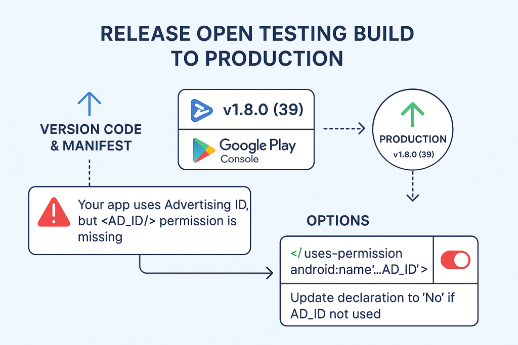
Limited Time Offer!
For Less Than the Cost of a Starbucks Coffee, Access All DevOpsSchool Videos on YouTube Unlimitedly.
Master DevOps, SRE, DevSecOps Skills!
Who Is It For and Why?
Before you design anything, ask yourself:
- Who is going to use this app daily?
- What are they trying to achieve?
- Where do they struggle the most?
For example:
- SEO Engineers want to check keyword rankings and technical site issues quickly.
- Digital Marketers want a dashboard that helps them plan, schedule, and track campaigns.
- Influencers and Publishers want to manage collaborations, content performance, and earnings easily.
💡 Pro Tip: Write down real-world tasks like:
- “Check top 10 ranking keywords”
- “See which social post got the most clicks”
- “Create a new marketing task with deadline and priority”
Your UI should make these actions feel effortless.
Choose the Right Tools That Empower, Not Overwhelm
Design tools can either accelerate your work or slow you down with clutter. Here are the tools you should consider based on your needs:
- Figma: Great for design mockups and collaboration. Use it to visualize your app before you touch any code.
- FlutterFlow: If you’re using Flutter, this is a game-changer. Drag-and-drop your app, see it live, and export clean Dart code.
- Framer: Helps you create interactive prototypes you can test with users.
- Uizard: If you’re not a designer, describe your UI in words or sketches, and it will create mockups for you.
- Penpot: Prefer open-source? This one’s for you. A free Figma alternative that works in the browser.
Choose one and stick to it throughout your design process.
Start With Purpose: Design Based on Real User Goals
Don’t start with buttons and colors. Start with intent. Here’s how to plan your app screens.
Example: A Dashboard Screen for SEO Engineers
Imagine your user is sipping coffee and wants a quick glance at:
- Site health status
- Top keywords with rank changes
- Backlink summary
- Recent tasks or alerts
Design this as a dashboard with clean, digestible blocks. Each card should answer one specific question like:
- “Is my site okay?”
- “Which keyword dropped in ranking?”
- “Are there any tasks pending?”
Keep everything scannable within 10 seconds. That’s the magic window.
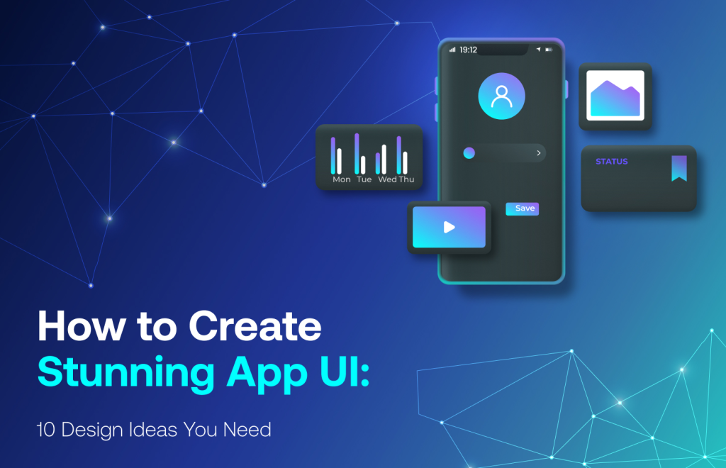
Craft a Beautiful, Usable Interface: Best Design Practices
Let’s make your UI not just functional, but delightful to use. Here are the golden rules:
Keep It Simple and Focused
- Don’t overwhelm the user. One main action per screen.
- Remove anything that doesn’t help with decision-making.
Make It Consistent
- Same color, padding, button size across the app.
- Use a consistent typography hierarchy (e.g., Title > Subtitle > Paragraph).
Design for Touch
- Buttons should be large enough to tap easily.
- Avoid cramming too much into small spaces.
Guide the User
- Use step-by-step forms, tooltips, and subtle animations.
- Provide clear feedback: “Task Created”, “Upload Complete”, etc.
Use a Design System to Stay Clean and Scalable
You don’t need to design every button from scratch. Use a design system or UI kit so you stay consistent.
Recommended options:
- Material Design 3 (for Android/Flutter apps)
- Untitled UI (Figma-based for mobile/web)
- Tailwind UI or ShadCN (if building for web with React)
These kits come with ready-made components like:
- Input fields
- Modals
- Tabs
- Alerts
- Cards
Start with them, then tweak the styles to match your brand colors and fonts.
Build Interactive Prototypes and Test Early
Don’t wait till you’ve written 1,000 lines of code. Share a clickable prototype with your team or users.
Here’s what to do:
- In Figma or Framer, wire up your screens with interactions.
- Share the prototype URL with your actual users.
- Ask them to complete key tasks like: “Create a campaign” or “Check keyword rankings”.
Watch how they navigate. If they pause, get confused, or ask questions — fix the flow before you start coding.
Convert Your Design to Code (With or Without Coding)
If you’re a Flutter developer:
- Use FlutterFlow to export code from your design.
- Or hand-code using widgets like
Container,Card,ListView,Stack.
If you’re working with a team:
- Share Figma links with developers, including spacing, font sizes, colors.
Sample Flutter Code:
Card(
  shape: RoundedRectangleBorder(borderRadius: BorderRadius.circular(16)),
  elevation: 3,
  child: Padding(
    padding: EdgeInsets.all(16),
    child: Column(
      crossAxisAlignment: CrossAxisAlignment.start,
      children: [
        Text("Top Keywords", style: TextStyle(fontSize: 18, fontWeight: FontWeight.bold)),
        SizedBox(height: 12),
        Text("1. wizbrand tools - Rank: #3"),
        Text("2. seo dashboard - Rank: #7"),
      ],
    ),
  ),
)
Test, Improve, and Repeat
After building, you’re not done. You need feedback.
- Show it to your team and real marketers/SEOs.
- Use tools like Firebase Analytics, Hotjar, or PostHog to track how users interact.
- Add success/error messages everywhere. People love knowing what just happened.
Final Tips to Keep Your UI Best-in-Class
- Always use real user data in mockups. It makes testing and understanding 100x better.
- Use white space. Clean design isn’t empty — it’s purposeful.
- Don’t chase trends. Build what your users need, not what Dribbble says is cool.